Bring out Century Schoolbook
On models of communication, the constraints of typewriters, and why it's self-defeating to use a mediocre font when superior alternatives are readily available

The essence of communications as a theory comes down to a simple theory that there are four components to communciations: The sender, the receiver, the message itself, and the channels through which the message passes. The whole thing can be made much more detailed than that, but for most purposes, little is gained by adding complexity. (It should be acknowledged, for instance, that communication is usually a dynamic process involving feedback and signals that cross paths in real time, but even that insight is mainly about adding to the existing model, rather than differing with it.)
■ Most people intuitively understand the “sender” and “receiver” bits, but the nuances of the “message” and “channel” parts are where ignorance and misunderstandings come thundering in. Take, for instance, the decision to revert the State Department to using Times New Roman as its official printed font family.
■ Font choices are largely a modern concern. If you weren’t a book publisher or printer, the until about 1985 or so, you had a typewriter that mostly produced the same fixed-width letters as every other typewriter. Computers brought about a dazzling array of font choices, and ever since, a great deal of effort has gone into optimizing the shape of letters.
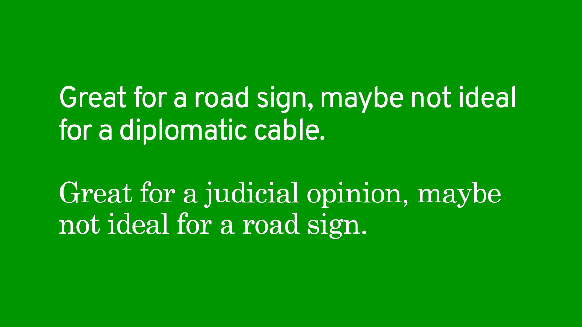
■ Big informational signs, we have long known, work best with clear and unadorned letterforms. On American highways, you’re probably looking at signs in Highway Gothic -- and it’s been that way for more than half a century. On the printed page, the consensus has long favored fonts with good proportions and gentle serifs, of which Garamond is a prime example.
■ Things get a little strange when they have to appear both on-screen and in print, because they reach the eye in different ways (print on paper relies on reflected light, while screens radiate light) and thus favor different features. The US Supreme Court requires the use of some flavor of Century, which tends to hold up reasonably well on-screen, while Microsoft developed Georgia specifically for better performance of long segments of on-screen text.
■ Using font choices to signal political favor or disfavor is truly an act of folly. A completely legitimate discussion can be had over whether to use different fonts for different purposes -- the needs of a wayfinding sign are totally different from those of a diploma -- but any debate should center on optimizing the transmission of a message through its channel, so that what the sender intends is what is successfully received by the largest possible audience of intended receivers. Doing otherwise is self-defeating.